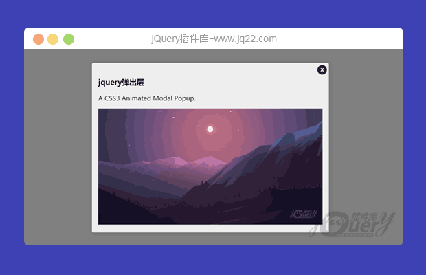


插件描述:适用于您的应用程序的模态和弹出窗口, 支持animate.css。
jQuery.popup.js
适用于您的应用程序的模态和弹出窗口。 支持animate.css。
使用方法
在页面中引入下面的文件。
<link href="css/animate.css" rel="stylesheet"/>
<script src="js/jquery.min.js" type="text/javascript"></script>
<script src="js/jquery.popup.js"></script>
HTML结构
<div id="myModal" class="myModal">
  <!-- Modal Content Here -->
  <h3>Modal Title</h3>
  <p>Modal Body</p>
  <!-- Custom Close Button -->
  <b class="myModal-close js-popup-close">x</b>
</div>
CSS样式
.myModal {
  max-width: 600px;
  padding: 1em;
  background: #eee;
  display: none;
  position: relative;
  box-shadow: 0px 0px 15px 0px rgba(0, 0, 0, 0.15);
}
/*关闭按钮*/
.item-close {
  cursor: pointer;
  right: 5px;
  top: 5px;
  position: absolute;
  background: #222;
  color: #fff;
  border-radius: 100%;
  font-size: 14px;
  height: 24px;
  line-height: 22px;
  text-align: center;
  width: 24px;
}
初始化插件
$('#elem').popup();配置参数
$('#elem').popup({
      background: "#000",
      position: "absolute",
      opacity: .5,
      zIndex: 123456788,
      classAnimateShow: '',  // animate class, link https://daneden.github.io/animate.css/
      classAnimateHide: '',  // animate class, link https://daneden.github.io/animate.css/
      time: 400,
      onPopupClose: function(){},  // 功能后弹出窗口关闭
      onPopupInit: function(){}  // 函数后弹出 init
});
PREVIOUS:
NEXT:
相关插件-弹出层
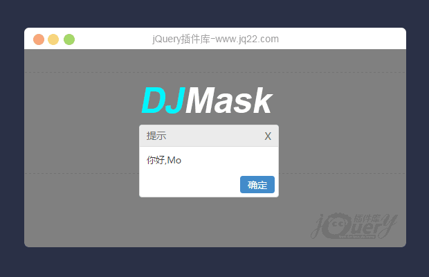
一款简单实用的弹窗插件JMask(原创)
JMask是一款遮罩插件,其小巧灵活,在项目开发中方便实用。使用方式也特别简单,只需要引入一个js文件,该插件基于JQuery开发,所以使用之前需要引入JQuery文件。
弹出层

讨论这个项目(2)回答他人问题或分享插件使用方法奖励jQ币 评论用户自律公约


😃
- 😀
- 😉
- 😥
- 😵
- 😫
- 😘
- 😡
- 👍
- 🌹
- 👏
- 🍺
- 🍉
- 🌙
- ⭐
- 💖
- 💔
😃
取消回复
- 😀
- 😉
- 😥
- 😵
- 😫
- 😘
- 😡
- 👍
- 🌹
- 👏
- 🍺
- 🍉
- 🌙
- ⭐
- 💖
- 💔
